Expressionism was another child of the modernist movement, which came about in Germany in the early 20th century. It overlaps a lot with other –isms of the period such as Futurism, Vorticism, and Surrealism, and I covered Futurism in a previous post so I’m not going to repeat myself.
The basic definition of it is this:
noun: expressionism
a style of painting, music, or drama in which the artist or writer seeks to express the inner world of emotion rather than external reality.
Abstract expressionism introduced the principle of action painting (or “gestural abstraction”), where the application of paint is random. Paint is thrown, spilled, smeared (and various similar verbs) onto the canvas, and the result is the essence of whatever the artist was trying to convey (if they were trying to convey anything at all). Take this piece below:
“Painting Number 2”, Franz Kline, 1954
I don’t get it. The section of smaller brushstrokes at the top makes me think of someone sitting at their desk, and the larger lines are like a floor or some kind of basic geometrical representation of a rectangular-shaped room. I have a friend who says if you need to read some long explanation of something in order to get its meaning, it’s not a successful piece of art. This painting doesn’t even have a remotely descriptive title, which just convinces me more that it’s just whatever the artist felt like painting at that particular moment. The interesting thing about Kline was that he would do many sketches to plan out the composition before painting. As for message, who knows? If what he was trying to say was precisely that he had nothing to say, then we’re getting into headache territory.
Speaking of having nothing to say, we have Kazimir Malevich’s “Black Square”, which while not abstract expressionist (it’s Suprematist – an art movement that Malevich founded himself), is similar thematically to what I’m talking about:
“Black Square”, Kazimir Malevich, 1915
The Tate website has infinitely nicer things to say about it than I do, including this quote:
“The experience of viewing the painting thus involves a feeling of pain brought about by the breakdown of representation followed by a powerful sense of relief, even elation, at the thought that the formless or massive can nevertheless be grasped as a mode of reason.”
Personally – pain, yes. A ten year old could have painted this. Ironically, while part of the point of it was that it lacked texture, over the years the paint has cracked and now it looks like this. Take that, Malevich.
Back to expressionism! Next we have Jackson Pollock, the father of drip painting. Most of his paintings were numbered, because he specifically wanted to viewer to abandon any preconceptions they might gain from a descriptive titled (I can see where he’s coming from there).
“Number 5, 1948”, Jackson Pollock, 1948
This painting is the most expensive painting ever sold – for $140 million. That’s an eye-watering amount of money to spend on anything, really, but it was spent on what is basically a concoction of various drizzled paint on top of fibreboard. John Squire did similar work for The Stone Roses’ debut album in 1989, and were it not for the orange slices and the red/white/blue, you could probably show that to someone and convince them it’s a Pollock painting. Hell, I’ve created meaningless textured things by picking random paints/inks and plonking them on some paper in different ways, but specifically to use as a background texture to overlay over something else. I would never remotely consider submitting something like that as a final piece.
This is a horrible quality video, but has Pollock explaining his working method:
The more I read into Pollock, the more sympathy I have for him. He was reclusive and suffered from alcoholism, and after a nervous breakdown in the late 1930s he received Jungian psychotherapy. He was considered “extremely unverbal”, so his doctor encouraged him to do “psychoanalytical drawings” as a way of communicating his feelings. Maybe this developed into his later work – was he expressing himself through his paintings as a form of therapy, but keeping the meaning to himself? I guess we can only speculate.
Futurism’s name is kind of self-explanatory – it was the early 20th century idea of how the future would be. The movement was founded in 1909 by the Italian poet – F. T. Marinetti – in his ‘Futurist Manifesto’ based on the principles of love of technology, speed, and violence. Marinetti would later start the Futurist Political Party, become a supporter and associate of Benito Mussolini (and his Fascist Party), and then become co-writer of the Fascist Manifesto. When Hitler’s degenerate art show tried to enter Italy and also tried to include futurist art within the exhibition, Marinetti persuaded Mussolini to put a stop to it. Marinetti’s part in Mussolini’s regime had resulted in some level of acceptance of modern art in the country.
“The Revolt”, Luigi Russolo, 1911
In case that wasn’t enough of a hint, here is a quote from the Futurist Manifesto, which will probably give you a very clear idea of Marinetti’s world view:
“We want to glorify war — the only cure for the world — militarism, patriotism, the destructive gesture of the anarchists, the beautiful ideas which kill, and contempt for woman.”
To be honest, the manifesto itself is bonkers (there’s a translation of it here). It’s full of grandiose statements – how we should destroy museums and libraries and any connections to our history, put a stop to feminism and morality, and embrace industry, machinery, youth, rebellion and so on.
“Charge of the Lancers”, Umberto Boccioni, 1915
Stepping away from the political madness, futurism brought some very interesting art into the world. A key artist from the movement was Umberto Boccioni, who is closely associated with ‘dynamism’ – the futurist way of describing the motion of an object. Boccioni often worked with collage, combining found papers with loose brushstrokes and abstract shapes, and the results definitely had a sense of movement.
“Dynamism of a Man’s Head”, Umberto Boccioni, 1914
Presumably Boccioni had similar views to Marinetti, but we don’t really get to see them develop – he died in 1916 as a result of a training exercise, having been drafted to fight in World War I. It would have been interesting to see where his work would have gone, especially by the 1940s.
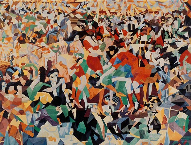
Another key futurist was Gino Severini, who had met Boccioni while they were both studying under Giacomo Balla (who was teaching them divisionist painting techniques), and was later invited by Boccioni and Marinetti to help found the movement. Severini was very into dynamism but not interested in machinery, so he would primarily study the movement of people. I think his best work is the one below, which was originally painted in 1909-1911 but accidentally destroyed in Berlin in 1926. He later repainted it in 1959-1960:
“The Dance of the Pan-Pan at the “Monico””, Gino Severini, 1909-11/1959-60
I think the reason why it appeals to me is that it’s capturing the essence of a situation without being a perfectly accurate representation of it. It’s tells the story pretty well – crowds of dancers and musicians and people sitting at their tables drinking, the overall mess of sight and sound that goes with a night out.
The poet Apollinaire criticised the futurists as being pretentious and provincial (which Severini would later agree with), and based on what I’ve read about them, I think he has a point. Ideologically they seem a bit like a group of annoyed teenagers, but I think they make up for it a bit with their artistry. It basically died out when Marinetti died in 1944, but during its time it influenced art deco, vorticism, surrealism and dada (and much later, the design of the city in Blade Runner).
Modernism, post-modernism, post-post-modernism, neo-modernism… anything that involves various prefixes and “modernism” isn’t really my cup of tea.
Two particular offshoots – abstract expressionism and conceptual art – confuse me more than others. I’m torn between the part of my mind that thinks art is whatever you want it to be and that people should be free to express themselves however they want to, and the part that doesn’t approve of people getting paid inordinate amounts of money for what seems to have taken as much effort as it did for me to get out of bed on a cold morning. Does throwing paint at a canvas make you a great artist? Is dedicating your life to trying to shock people an admirable thing to aspire to? Why is it okay to use lackeys to actually create the piece, then take all the credit yourself?
I feel naturally prejudiced against conceptual art, because it gives off the impression of minimal effort. Marcel Duchamp wrote his pseudonym’s signature on a urinal. Tracey Emin put her bed complete with dirty sheets, pants, cigarettes and similar detritus in a gallery space, and was shortlisted for the Turner Prize.
“My Bed”, Tracey Emin, 1998
I want to believe that they put a lot of thought into what they were doing and came to some kind of meaningful conclusion, but I just have this immediate negative reaction when I hear about stuff like this. I can’t separate it from the point of view that anyone could do it – it has very little or no connection to artistic skill and it feels unjust that they get kudos for it. The average person could do exactly the same and just be called an idiot. What makes them so special, the ability to bullshit a meaning for something?
My best grade in my foundation year was for a conceptual art project – the project I put the least effort into. I only vaguely understood the brief, and I basically spent three and a half days painting fruit and veg. I photographed it during the project, then again a month later to show how the food had decayed, if at all. It was fun in a childish let’s-throw-paint-at-this sort of way.
Time & Construction project, me, 2012 (this is silly)
My inspiration (so, ‘concept’, I suppose) was accidentally caused by my discovery of Strawberry Volvic the weekend before the project started – a drink which looks like water but tastes like yoghurt. I can’t even begin to explain how horrifying that is to my idiotic subconscious, it just does not compute (my housemate drinks tons of the stuff and thinks I’m mad, which I think is a fair assumption).
In the end I submitted a folder of photos with a title page saying “Would You Eat This?” and in response, I got a B2. I didn’t expect or feel I deserved a grade that high, especially when projects that I put a lot into got me various kinds of C grade. The mind boggles.
Despite my intense dislike for conceptual art in principle, I do like Marina Abramović. I find her fascinating, and some of her work is really interesting because of how it involves the public. In 1977 she did the performance piece “Imponderabilia” with her collaborator (and lover), Ulay, where they stood naked facing each other in a doorway in a gallery space and people had to walk through the gap between them. On face value that sounds pretty odd, but it’s interesting because the visitors had to make the choice of who to face as they passed through. It often resulted in someone passing between them very awkwardly (practically pushing them out of the way) in an attempt to not have to face either one of them. The gap slowly gets smaller and smaller as they move closer together, but eventually the local police caught wind of what was going on so put a stop to it.
A later collaboration with Ulay – “The Great Wall Walk” had Abramović walking from one end of the The Great Wall of China to the middle point of it 2500 kilometres away, while Ulay walked to the same spot from the other end. They planned to meet in the middle, and get married. It took around 8 years to get permission from the Chinese government to do this, and during that period their relationship deteriorated. They finally did it in 1988, but instead of getting married when they met, they said goodbye. I can’t imagine ever doing anything as dramatic as this myself, especially to break up with someone, but I quite like it. Some people seem to exist on a more spiritual level than the rest of us.
“The Great Wall Walk”, Marina Abramović & Ulay, 1988
Her work at MoMa in 2010 – “The Artist is Present” – was a silent performance where she sat at a table in the museum for 736 hours, while spectators came and sat opposite her, each for a short time. It’s amazing to see the emotional responses she can evoke, and I have to admit I got teary when I saw how she was affected – particularly when she is reunited briefly with Ulay, who visited on the opening night. It’s made a bit sickly by the added music in the video below at roughly 1:20, so I’d recommend watching it without sound.
It seems like so much is communicated between the two of them without a word being said, and even just re-watching it now is making me tear up. A sceptic would say they planned it in advance but honestly, I don’t care if they did. What they went through and worked on together defined who they became, and the sappy romantic in me wants to burst into tears at the thought of it. Did they need to do all of those performances in public? I don’t know, but it takes a lot of discipline and dedication to do what she does, and I admire her for that.
I never intend to go off on an overly long tangent, but I seem to be good at it. I’ll leave abstract expressionism for a later post.
If you haven’t seen Sunshine or Alien and care about plot details, you do not want to read this post. Partly because you won’t know who the characters I’m talking about are, but also because of major story spoilers. You have been warned!
– PREDICTABILITY IN FILM –
I missed the Animation and Narrative lectures due to being ill, but I already had an idea for what to write about anyway so here we go – predictability in film. There is a seemingly endless list of tropes related to this, but two that cover it quite simply – Chekhov’s Gun and the Red Herring. I had a long list of films that I wanted to talk about relating to these, but I’ve had to cut it down to two because I could literally go on about them forever.
Chekhov’s Gun as a trope is derived from this quote:
“If you say in the first chapter that there is a rifle hanging on the wall, in the second or third chapter it absolutely must go off. If it’s not going to be fired, it shouldn’t be hanging there.”
This principle is firmly ingrained in my mind – don’t draw attention to something (such as with a close-up of a specific object) unless it is going to have some importance later. I’m usually pretty okay at working out a twist/key plot point/punch line before it happens, because generally the clues (visual or otherwise) are there.
Meanwhile, The Red Herring trope applies to when something leads you to the wrong conclusion – a lot of murder mysteries set up the ‘obvious’ murderer who doesn’t have an alibi within the first act, who then turns out to be innocent. We’re so used to this formula now that if that person did turn out to be a murderer it’d be a surprise. Anyway, here are a couple of examples of predictability (or lack thereof) in films that have stuck in my mind:
– SUNSHINE –
Before I start complaining and give off the wrong impression, I really like Sunshine. It’s interesting psychologically, particularly with how the situation affects each of the crew. For example, Cassie is obviously exhausted and is the first to accept that they’re not going to survive, Corazon is intensely protective of the oxygen garden and is the most affected when it’s destroyed, Searle and Kaneda seem to become obsessed with the observation room, which fits in with Pinbacker’s descent into madness on the Icarus I. I liked how they dealt with not having enough oxygen to keep the remaining crew alive and still make the payload – the majority’s willingness to sacrifice someone else for the ‘greater good’ being contrasted by Cassie’s refusal to be involved in such a decision. The film spends a lot of time on characters rather than on action/special effects sequences, which can only be a good thing.
It’s a gorgeous film to look at (most films set in space are going to satisfy me visually), and its score is by one of my favourite soundtrack people (John Murphy), and I like the overall atmosphere up until Capa finds Pinbacker in the observation room, where it then goes down into chase-madness-stabby-stab territory and doesn’t really recover until a very brief moment at the end, which wasn’t enough to redeem what had just happened (for me, anyway).
The irritating thing is I was waiting for it, because I’m naturally superstitious. The film starts with Capa talking about the failed first mission to create a new star within the Sun, which would save the currently-freezing Earth. Literally a minute and a half into the film I had decided they were most likely all going to die, and this was purely because of the name of the ship – the Icarus II. The Icarus II follows the failed Icarus I mission, which itself was named after the mythical character of Icarus, who flew too close to the sun and got himself killed. Why would you name something after that?! It would be like naming a ship the Titanic II (which to be fair, someone with more money than sense is doing). Gradually more and more things start to go wrong, so when the inevitable doom does happen, it’s not a shock.
Could it be called foreshadowing, or was it just flat out silliness? Personally I think the best kind of foreshadowing is something that goes unnoticed until a repeat viewing, where seemingly insignificant things take on new meaning. At some point Mace says to Trey, “Don’t kill yourself” because Trey is beating himself up about the fact that he messed up something vital with the navigation, and the moment is treated as just a quick reassurance, and you realise later that it’s cool foreshadowing because Trey does kill himself.
I’m pretty forgiving when something I like falls short on some level, and I don’t for a second think Sunshine is a bad film, I just feel like they didn’t have to do what they did in the way that they did it.
– ALIEN –
Alien was probably the first film I saw which followed the formula of the Everybody Dies trope (or the everybody-dies-except-one-or-two variation), and going into it with no background knowledge of what it was, when I was possibly too young to watch it, I thought it was brilliant. The great thing about it was that Ripley wasn’t even obviously the main character at first – if anything the first act of the film is more about Kane and Dallas (I instantly liked Kane, so of course Kane was the first to die). It played with your expectations and kept you in suspense right up until the end. It’s been nearly 35 years since Alien, and I feel as though we’re at a point where that kind of story doesn’t really work unless it’s given some kind of killer twist. More often than not it seems to just be retreading old ground – I’m looking at you, Prometheus. As a sort-of-prequel to the Alien franchise, it had a lot of potential to be interesting, but in the end it just felt like a missed opportunity. CinemaSins explains it more entertainingly than I could:
In general, I love films which give you a false sense of security then slap you in the face with something unexpected. If you think someone or somewhere is safe and then something terrible happens it hits you a lot harder (Serenity is a very good example of this, as is Mass Effect 3). On the other hand, if I’m really invested in a set of characters, I’m going to be swept away in whatever’s going on regardless of whether or not I know the outcome. Toy Story 3 made me audibly whimper in the cinema when I saw it a third time because I was so caught up in it, and the beginning of Up doesn’t get any easier to watch despite having seen it countless times.
In the end, no matter how much you try to perfect a story, to deviate from formulaic nonsense and innovate etc. – everything comes down to personal opinion, and you’re not going to please everyone. Filmmaking is hard.
This lecture focused on the medieval period, and one of the things that caught my eye was one of the common themes in art at the time – death. I find religious allegory interesting, particularly from this period, so I thought it could be fun to write about Dante Alighieri’s “The Divine Comedy”. An epic poem, it was written between c. 1308 and 1321 (when Dante died). It is divided into three cantiche (narrative poems) – “Inferno”, “Purgatorio”, and “Paradiso”.
In the poem the main character is Dante himself, portraying himself as a pilgrim being guided through the three stages of the afterlife, initially by Virgil (the ancient Roman poet), then by Beatrice (Dante’s ideal woman, who is believed to have been inspired by Beatrice Portinari, whom Dante only met twice). Hell is depicted as a dark forest, Purgatory as a barren mountain, and Paradise is the Garden of Eden at the top of the mountain.
“There is no greater sorrow than to be mindful of the happy time in misery…”– Inferno – Canto V
“The Divine Comedy” is not light reading by any means (the paperback alone being 752 pages long, without illustrations), but it’s still an interesting read. It has been interpreted by various artists over the centuries, perhaps most notably Sandro Botticelli, Gustave Doré, and Salvador Dali. The three of them brought completely different styles to the imagery, so all three are included here.
– BOTTICELLI –
A decorated edition of “The Divine Comedy” was published in 1481, with drawings created by Botticelli, then engraved by the etcher Baccio Baldini, an example of which is shown below:
Botticelli also designed a parchment named “Mappa dell’Inferno” (Map of Hell) in the 1480s, showing the circles of Hell as layers of the Earth, leading down to Lucifer in its core. Each circle is for a specific sin or crime, starting with Limbo (for the unbaptized), then lust, gluttony, greed, wrath and sloth (sharing a circle), heresy, then the remaining circles are subdivided. Violence (the seventh circle) is divided into violence against other people, violence against themselves (suicide), violence against God. The eight circle is fraud (or Malebolge, which translates as “evil ditches”), and is divided into ten ditches for various ‘criminals’ such as seducers, astrologers, thieves, corrupt politicians, alchemists, among others. The ninth and final circle, treachery, is divided into four rounds – traitors to kindred, traitors to their country, traitors to guests, and traitors to lords. It’s difficult to find a high quality/resolution image, mainly due to the age of the parchment:
– DORÉ –
Gustav Doré’s work was published much later than Botticelli’s – in the 1860s. He produced 135 engravings for the book, and they are incredible. At times they are grotesque (with overly exaggerated muscles), capturing the potential horrors of Hell stunningly – they would have been very effective in scaring the god-fearing people of the middle ages. The lighting is dramatic, drawing the eye to the most striking parts of the image, and they are full of depth. I could stare at the details forever. For example:
“But he cried out, “Be none of you malignant!” – Inf. XXI, line 72
“Soul idiotic, / Keep to thy horn, and vent thyself with that, / When wrath or other passion touches thee.” – Inf. XXXI, lines 70-72
“Look how thou steppest! / Take heed thou do not trample with thy feet / The heads of the tired, miserable brothers!” – Inf. XXXII, lines 19-21
The image above has more midtone-lighting and minimal shadow, but the highlights draw you to the faces lurking at Dante and Virgil’s feet.
– DALI –
Salvador Dali came to the work around the early 1950s and produced 101 watercolours, which were exhibited in galleries. In a way, Dali was perfect for the story because he could bring a completely different take on it. The way Botticelli and Doré approach their inhabitants of Hell is quite grounded in reality – we recognise them as a reflection of ourselves (perhaps with wings added, but nothing too surreal). Dali took it to another level:
Aspects of each image are clearly human, but they’re twisted, literally in the case of the right hand image – which depicts the Wood of Suicides – combining limbs and torsos to create the trees.
– OTHERS –
Moving away from illustration briefly, the sculptor Auguste Rodin created the very imposing sculpture “The Gates of Hell” (link! http://www.musee-rodin.fr/en/collections/sculptures/gates-hell) which is 6 metres high, four metres wide, and features around 200 individual figures. It features Dante just above the door in the pose that most would recognise as Rodin’s other sculpture, “The Thinker”, shown below:
“The Divine Comedy” has had countless influences on popular culture, in film, literature, and games. A lot of comics reference it, for instance Neil Gaiman’s “The Sandman” contains the Malebolge, Wood of Suicides, and the city of Dis, all derived from Dante. There are various references to it in video games, most obviously in Visceral Games’ “Dante’s Inferno” which is an adaptation of the first canticle, and reimagines Dante as a member of the Knights Templar. Below is Botticelli’s portrait of Dante from the 15th century, and Visceral’s 21st century take on a 12th century Dante:
Whatever next?
Sources:
None of the images belong to me unless stated otherwise, and were acquired primarily from Google images.
There were various things in this lecture that interested me, but I couldn’t decide on something specific to focus on so this is going to be a little bit about a couple of different things. I’m not overly happy with it, and I’m planning another post on Text later to make up for it.
HANDWRITING
During the lecture there was a brief mention of handwriting in schools and whether it should still be taught, considering the increased use of computers in the past 15+ years. Although the need for handwriting in day-to-day life has lessened, I think it’s important that children at the very least learn how to write legibly. While most of us are permanently in grabbing distance of some kind of device with a notepad feature built into it, you can’t beat taking notes with pen and paper when you need to get an idea down quickly. On the other hand, I would much rather write an essay on a computer since it’s so much easier to rework it than on paper.
When I was at primary school we had a specific time set aside to practice handwriting in its own dedicated jotter so we could easily see our progression. My teachers were quite strict about it – I was always told off for not writing the lower case ‘r’ properly, because mine would look more like a ‘v’. Pretty much as soon as I left primary school I stopped using joined up handwriting and started writing how I wanted to, and I think my handwriting is pretty cartoony as a result. I thought it’d be interesting to compare mine and some of my friends’ handwriting, particularly since we had similar experiences of how to write ‘properly’:
I think the two most unique sets of handwriting out of the five of us are probably Shannon’s and Cameron’s – Shannon’s writing is the most cursive (and the most grown-up seeming, to me anyway!), while Cameron’s seems very controlled and straight. Lorna’s is very small and neat, Laura’s is the most slanted, and mine’s… mine. When I was a kid I purposely decided that I would dot my ‘i’s with a circle rather than a dot, because my older sister did that and I thought it looked nicer. For the past few years I’ve intended to make a font based on my own handwriting for lettering my own comics, so I think I’ve been influenced by the comics I read plus a general desire to have other people be able to read my upper-case handwriting easily.
I read a bit into graphology (handwriting analysis) to see if I could discover some interesting things about us, but considering the fact that it is a pseudoscience, it is about as factual as astrology. This infographic doesn’t really work when applied to any of the handwriting above, especially when it talks about handwriting being related to health problems – apparently if the slant of your letters varies within a sentence you may have schizophrenia. It also says that if you write quickly you are, “impatient, dislike delays or time wasters” (or you’re just trying to keep up with a lecture!). This website even offers ‘in-depth analysis’ of your handwriting for £50 a pop, which speaks for itself really. There are obviously outside influences in how our handwriting has developed, but I don’t think it’s intrinsically linked to our personalities.
I really liked this quote from the end of the lecture:
“Writing, Socrates argued, is inhuman. It attempts to turn living thoughts dwelling in the human mind into mere objects in the physical world. By causing people to rely on what is written rather than what they are able to think, it weakens the powers of the mind and of memory. True knowledge can only emerge from a relationship between active human minds. And unlike a person, a text can’t respond to a question; it will just keep saying the same thing over and over again, no matter how often it is refuted.” – Walter J. Ong. Orality and Literacy, pp. 78-79
I agree with it to a certain extent, in that we should form our own opinions on things and experience them ourselves rather than taking someone else’s discoveries as fact. Reading about a place isn’t the same as visiting that place; hearing that a band is terrible doesn’t mean that you would come to the same conclusion yourself, etc. First-hand experience is important. However, the quote is quite ironic since societies have been built upon these ‘objects’ – words. Literacy = knowledge = power. I’d like to look more into how we acquire knowledge through text, and how it relates to truth – just because it is written does not make it true.
Week 3! After trying to absorb an introduction to semiotics, I decided I wanted to blog about how certain symbols can have multiple/contradictory meanings. This isn’t particularly related to semiotics itself, but the tasks we were given means I have to give it some attention. I have to admit, while I was aware of the existence of semiotics before this lecture, I probably wouldn’t have been able to tell you exactly what it is. The lecture itself helped make it a fair bit clearer, but my attempt to look into it further (on this website) wasn’t particularly successful. The realms of paradigmatic relations and syntagms (which spellcheck doesn’t even recognise) are beyond me.
To keep things simple (and to prove to myself that I’ve sorted out exactly what means what in my head):
Icon – representational
Index – directly connected to the signified – smoke relates to fire, a handprint relates to a person, etc.
Symbol – lost dependence on resemblance – the word that represents the object is a symbol (nouns are symbols, basically!)
Based on that, I collected these signs and labelled them:
Hopefully the only thing that possibly needs some explanation is the symbol/index – Hitchcock’s signature being the index and the drawing above it being a symbol of him. It’s a very simple illustration of his face in profile, which although part of his signature, is still an abstract representation of himself.
The second task was the continuum, my chosen subject being owls (for a variety of reasons):
(credits for the artwork at the bottom of the post)
Moving on from semiosis, the topic of re-appropriation of symbols came up during the discussion. The most obvious example of re-appropriation is the Nazis’ use of the Swastika, which had much more innocent origins than what is now associated with it in western culture.
The original Sanskrit word “svastika” simply meant “it is good” – combining “su” (“good”), “asti” (“it is”) and “ka” (a diminutive suffix). It is a religious symbol in Hinduism – used to evoke the Shakti (a divine power) – and it is also a symbol for wealth and good luck.
In the early 20th century people in Western cultures were using the symbol to share its original sentiment, but by the 1920s the Nazi Party in Germany had adopted it as their emblem, subverting it in the process. They gave it their own meaning, “das Symbol des schaffenden, wirkenden Lebens” which translates as “the symbol of creating, acting life” and they built up their own mythos of sorts – that the German people were descended from the Aryans, and were the ‘one true race’. We all know what happened next.
Because of the war, the swastika now has vastly different meanings depending on what part of the world you’re in. In Asia it has retained its original meaning, but in the West it can be seen as being incredibly offensive. In the 1970s, punks started using the swastika as a symbol for rebellion – to shock people – not because they believed in the Nazi regime. More recently, there were various attempts to ban the swastika in the European Union, which were unsuccessful.
An example of positive re-appropriation – while still related to the Nazis – is the pink triangle. While it is now synonymous with LGBT pride, its original purpose was to label ‘sex offenders’ – predominantly homosexual men – in concentration camps during the war. Every prisoner was labelled with at least a single triangle, the colour denoting their ‘crime’, with a double triangle to mimic the Star of David for Jews. A letter would be added for their country of origin, and bars would be added for repeat ‘offenses’. This was the chart they followed:
Gay rights activists started using the pink triangle in gay pride marches in the 1970s, and it is now one of the most popular and recognisable symbols in the LGBT movement. I’m not sure that many young people would know that its origins were to stigmatise.
Can it really change how LGBT people are seen, or is it just a symbol of solidarity? World War II ended nearly 70 years ago, but we still live in a world without equality for LGBT people, and in some countries homosexuality is criminalised to the point that it is punished by the death penalty. The mind boggles.
I’ve thought a lot about this subject over the past few days, and while I’ve gravitated towards how we communicate non-verbally, one of tangents I seemed to go off on while I was drafting my first post was plain old self-expression.
Everything we buy is some kind of expression of our tastes – it tells others what our favourite tastes, scents, materials, styles etc. are, and what kind of music/film/games we like. People like to own clothing with a particular brand name on it (Superdry, for instance), and are willing to pay more than they would for a similar item without the brand name on it (even though you’re basically paying to advertise their clothing for them).
Personally, I like my clothing to show other people what I’m interested in, but subtly – for instance this shirt would only be recognised as being a Monsters Inc. shirt if you remember the opening titles to the film, and this one will only obviously be Garrus if you’re aware of the Mass Effect games. I wouldn’t wear a shirt that said “NERD” on it any more than I would wear a shirt that says “GAMER” or “ANIMATION STUDENT” – they are aspects of who I am, but I’d much rather use a pretty picture to communicate that fact instead of describing it verbally.
A lot of people don’t seem to appreciate the need for aesthetics in today’s society. There’s obviously more to life than things just looking good – they need to have a function. We are constantly bombarded with visual communication in the form of advertisements and branding, and the amount of advertising that invades our lives only increases as technology gets more sophisticated. It’s an unavoidable evil, but it is softened if the communication is entertaining and or/visually pleasing.
Last year Tesco rebranded their “Tesco Value” range as “Everyday Value” and actually put some effort into making the packaging more appealing to customers, instead of looking like food you would only buy as a last resort in the event of financial troubles or some kind of apocalyptic bunker-requiring disaster. Here is a comparison of the two:
It’s not on the same level of aesthetic as, say, Coralie Bickford-Smith’s work for Penguin (the classics section in Waterstones is full of books with this approach to the cover design, and they’re beautiful, tactile and are infinitely nicer looking than my scaffy old paperbacks, but it doesn’t really make any difference to the quality of the content), but it’s an improvement! We need to celebrate the value of designers, because they quite simply make life more bearable.
(In my weak defense – I’m not as superficial as I sound!)
I find the history and development of communication as a whole interesting, particularly how the need for visual communication has changed throughout the ages. Before we were able to communicate verbally, it was an essential part of being able to share complicated information in an effective way. Tens of thousands of years ago, cave paintings communicated shamanistic rituals and daily life to the tribe. Petroglyphs are believed to have been an early form of maps, marking the layout of the land as people discovered it and passing that knowledge and experience onto others – for example, I think the petroglyph below was a way for whoever carved it to share their experience of travelling with their herd through that area:
Fast forward to the Middle Ages – in the 15th century the paintings of Hieronymous Bosch were a way of communicating religious narrative and basically striking fear into the hearts of the uneducated. His triptych – The Garden of Earthly Delights – is a fantastical depiction of three scenes – the Garden of Eden, how the human soul can be corrupted by sin, and Hell. When the panels are closed it shows the creation of our world as the Bible describes it. This was a far more effective way of conveying Christian morals than teaching the masses how to read the Bible themselves. Art was an effective way of sharing the story of what they believed the original human experience to be, whether it was factual or not
Nowadays comics are a good way of sharing experiences, and as storytellers-in-training we are told that the best way to tell a story is with as few words as possible (that isn’t to say that something should be devoid of words entirely, it’s just easy to get distracted from the overall effect of an image if you’re busy having to read a paragraph of text in order for it to make sense). If you can clearly see what is happening, you don’t need a character/narrator to verbally explain it. Take the image below:
This is from Craig Thompson’s gorgeously illustrated autobiographical graphic novel (bit of a mouthful there!), Blankets,which is about Thompson’s late teens/early adulthood, and his first love. Their relationship ends, and this panel is part of how his character expresses the feeling of losing her. On its own without the preceding backstory included the book, the message wouldn’t necessarily be clear, but with that, Thompson can get away with having a page dedicated to one wordless image, giving it much stronger impact. For me, that page and the below panels say so much more than pages of verbally describing how it feels to lose someone ever could.
Something I’ve noticed is that this country seems to have a problem with taking comics and animation seriously – consider the fact that anything animated (unless it’s anime, which is given its own section) is categorised as “Children’s” in shops such as HMV (something which I don’t think will ever change, but will forever annoy me). This just encourages people to dismiss animation as being for children. Comics are now re-labelled as ‘graphic novels’ in a lot of cases just to make it sound more grown up.
When I talk to my family about comics they’ll occasionally ask if I ever read ‘real books’. Don’t get me wrong, I love a good book where my imagination can be stimulated, but as somebody who wants to work in both animation and comics in my future career, I try to absorb whatever visual storytelling I can get my hands on. I find that reading comics is more useful than reading books on how to create comics, since I can work out what works and what doesn’t instinctively (in the end this obviously comes down to personal opinion/preference, there is no golden formula). Do people see ‘picture books’ as the simplest/lowest form of communication because that is what we used to communicate before we were capable of sharing complicated ideas verbally? Is verbal communication the most intellectually stimulating?
I have more I want to say relating to this subject, but it doesn’t really fit with the theme of this post so I’ll save it for a separate one.
(All of the below images included in this post belong to the Walt Disney Company)
This summer we were given a brief where we had to choose someone who had been influential in our field (animation in my case) and research them. I spent a while trying to decide whether I should choose someone obscure who had been influential to me personally but not necessarily to animation as a whole (I mindmapped it and made shortlists and all sorts of faffery), and choosing someone who had very obviously influenced it… in the end I went for the obvious.
– EARLY LIFE –
Glen Keane was born in Philadelphia in 1954, the son of Bil Keane – a cartoonist and creator of the syndicated newspaper comic strip “The Family Circus”. Watching his father work when he was a child was one of Glen’s primary influences in choosing to pursue a career in art.
After Keane had completed high school, he applied to the California Institute of the Arts (CalArts) to study sculpture. His application accidentally ended up in CalArts’ School of Film Graphics, where he was offered a place. During his time there he was mentored by Jules Engel – an artist who had worked on Disney’s “Fantasia” and “Bambi”, and had visiting lecturers including Frank Thomas and Ollie Johnston – two of Disney’s Nine Old Men (and writers of “The Illusion of Life”), who helped refine the 12 Basic Principles of Animation.
– DISNEY –
After CalArts, Keane applied to work at Walt Disney Studios, but was initially rejected. He reapplied after spending around a year working as a layout artist for Star Trek: The Animated Series, and was then hired by the studio. His first assignment at Disney was as an assistant animator on “The Rescuers” (1977), working on Bernard and Penny, under the supervision of Ollie Johnston. As assistant animator, his role will have been to take Johnston’s rough key drawings and do clean-up – redrawing the animator’s drawings on a new frame, with clean line work. An assistant animator will also add breakdown poses when there is a big difference between the animator’s keys, then pass all of the frames on to the inbetweener (who – as the job title describes – draws the inbetween frames).
By the time of Walt Disney Animation Studios’ next film, Keane had impressed his supervisors enough that he was offered the role of supervising animator on the bear (the antagonist at the climax of the film) in “The Fox and the Hound” (1981). During production he mentored Henry Selick, who cites Keane as an influence and who went on to direct “The Nightmare Before Christmas” and “Coraline”.
Keane left the studio briefly in 1983 after his contract ended, but continued to work for Disney as a freelancer, supervising the animation on Ratigan for “The Great Mouse Detective” (1986). Ratigan was a great character – he spends most of the film parading around like a member of high society (played beautifully by Vincent Price), but he hides a murderous rage that presents itself should anyone dare point out that he is a rat. By the end of the film he has turned rabid, and as a nice piece of added symbolism, his fancy clothes have torn to shreds.
He played a key part in the Disney Renaissance, working as supervising animator on protagonists in six of the ten films produced by the studio during this period (1989-2000). The first was Ariel in “The Little Mermaid” (1989), who he also designed.
“I went and told these guys “I really want to do Ariel.” They said “Well, I don’t know Glen, it’s supposed to be a pretty girl, can you do that?” I said “Look, I have to do Ariel, I can feel it in my heart” – from an interview featured in the 2009 documentary “Waking Sleeping Beauty”
Most of his prior animation experience had been on animals and later villains, but he was determined to work on Ariel after hearing Jodi Benson (her voice actress) singing “Part of Your World” and being captivated by her voice. His design for Ariel was inspired by his wife, Linda (her heart shaped face, blue eyes and turned-up nose in particular) as were some of Ariel’s mannerisms – for instance the way she bites her lip. Keane would later take inspiration from other family members in his work – Tarzan was inspired by his son, Rapunzel by his daughter, and baby Rapunzel by his granddaughter! This was something he sort of inherited from his father, who based the characters in his comic strip on his own family.
“I love characters that have this burning desire inside. This sense of believing the impossible is possible.” – interviewed in 2011 by Criticize This
After Ariel, Keane designed and animated Marahute in “The Rescuers Down Under” (1990). The design was based on the prehistoric Haast’s Eagle, making her much larger and more imposing creature than a regular eagle, capable of carrying Cody (the child protagonist) on her back. She is majestic and fiercely protective of her eggs, having already lost her mate to the film’s antagonist, McLeach. Marahute has some interesting design sketches, click the picture below for a better view:
His next assignment was Beast in “Beauty and the Beast” (1991), which I think is his best work. The film had a somewhat troubled production schedule – two years into the four-year development time the production team had to completely overhaul the story and setting of the film. As a result of this, everything had to be rushed (this is noticeable in places).
Keane was in charge of designing Beast, and his initial sketches had him looking more like a gorilla or a bull. He spent a lot of time at a zoo looking for inspiration, and in the end he combined different characteristics from many animals – the head of a buffalo, a lion’s mane, gorilla eyebrows, wild boar tusks, a bear’s torso and the lower body of a wolf. He retained one human feature – his eyes, which communicate his sadness at his situation (as well as his standing posture being hunched – he feels no reason to walk tall).
The film climaxes with what is quite possibly one of my favourite pieces of animation ever (in pencil test form), showing Beast’s death and transformation back to being human, shown here:
Ahh.
Keane’s next three characters are titular, starting with “Aladdin” (1992). Similarly to “Beauty and the Beast” the film had issues – a year and a half before it was due to be released the studio decided they needed to change the characterisation for Aladdin (among others). His design was inspired by Michael J. Fox, but originally he was going to be in early adolescence rather than late teens. This made any potential romance with the more mature Jasmine less believable, so they decided to up his age to 18, taking inspiration from male models.
“Pocahontas” (1995) was the first time that, in addition to being supervising animator on Pocahontas, Keane was also heavily involved in visual development and story (he worked on a lot of the storyboards for the film). Critically, “Pocahontas” was the least successful film the studio produced during the Renaissance, partly due to the historical inaccuracy of the plot (for instance, the real Pocahontas was 12 when she met John Smith).
Early designs for Pocahontas showed her as being younger (which had more character), but in the end they decided they wanted a supermodel feel, basing her to some extent on Naomi Campbell. This is the only film Keane has worked on where we have actually seen *his* drawings (since all of his animation is cleaned up by assistants) – during the “Colours of the Wind” sequence we see his charcoal drawings. This would ultimately contribute to why he left Disney – he decided he wanted to pursue animation projects where he could be more loose and expressive, rather than the finished product being heavily reliant on being cleaned up.
Keane’s third titular character was in “Tarzan” (1999), where he again also worked as a story artist. As research, Keane travelled to Uganda with his son to explore the jungle looking for gorillas (with the help of a guide). They found a family group of 13 gorillas, who he observed and sketched. He wanted to feel the connection that Tarzan would feel with his home environment.
The animation on Tarzan is interesting because of his upbringing as one of the gorillas – his muscles are exaggerated as well as his hands and feet to allow for more believable movement, and his mannerisms are certainly inspired by his gorilla family. He has an awkward relationship with his ‘father’, Kerchak, who never approved of his mate, Kala, taking Tarzan in in the first place (having lost their infant son to the cheetah Sabor, who also killed Tarzan’s parents). It’s interesting seeing the projection of gorilla behaviour onto Tarzan complemented by the projection of more human-seeming behaviour/problems onto gorillas.
The last film Keane worked on at Disney was “Tangled” (2010). At the beginning of its six-year development Keane was director and executive producer, but he stepped down as director in 2008 (remaining in charge of animation on the film). To begin with it was very much his project – he worked on it very closely with his daughter Claire, who is a visual development artist at Disney.
Keane and his team wanted the film to look like an oil painting (an early source of inspiration was Jean-Honore Fragonard, particularly “The Swing”) – using non-realistic rendering of 3D animation. This was the first exclusively 3D film that Keane had worked on, but he wanted to retain the traditional feel of 2D. He organised a seminar named “The Best of Both Worlds” where he and his colleagues discussed the pros and cons of both 2D and 3D animation. They came to a variety of conclusions about how the film should look, but at the time they were not possible with technology they had, so the studio need to create new ways to be able to achieve it – particularly her hair. Keane drew up a series of instructions on how her hair should look, which had been standard practice in passing his designs onto the other animators, but this time it was up to the software engineers to develop something capable of doing what he wanted in 3D.
“We’re starting the story with this young, vibrant, gifted person who has to get out and realise who she’s meant to be. That’s what the story is.” – Keane talking about Rapunzel in “The Art of Tangled”.
Rapunzel is such a relatable character because she is just beginning something most of us have to go through at some stage – leaving the safety of your home and family and finding your way in the world on your own. That said, most of us don’t then discover that our ‘mother’ is actually an old hag just trying to retain her youth, who stole you from your royal parents.
– GOING SOLO –
Having spent nearly 38 years and most of his professional life working for Disney, he left in 2012.
“I am convinced that animation really is the ultimate art form of our time with endless new territories to explore. I can’t resist its siren’s call to step out and discover them.”
– from his farewell letter to his co-workers.
In August 2013, at the annual D23 expo (Disney D23 is the official Disney fan club), Keane was made a Disney legend, and earlier this very week Keane’s future plans were revealed.
“I’m just about to start a little company. Glen Keane Productions. I’m starting very small with animation, drawings and the like. I’m about to start working on a new project that I really can’t start talking about yet. But I’ve got some ideas.”
– from an interview with Jim Hill Media
In addition to mentoring less experienced animators during his time at Disney, Keane regularly gives lectures at CalArts and does demonstrations at conventions. In advising other artists he produces simple but useful guides on what is important in animation drawings – general advice such as solidity and weight, and more character-specific guides, such as how to deal with Rapunzel’s hair in “Tangled”. His life drawing is fascinating to look at – he favours charcoal, and is greatly skilled at capturing the form accurately with very few lines.
“I see myself as an artist first. I’ve never thought of myself as a Disney Animator… …I put my portfolio in at CalArts to become a sculptor, a painter, and it was sent to the school of animation by mistake” – Keane interviewed in 2010
Keane helped define the Renaissance of Disney Animation, arguably their best period. His style is unique and recognisable, and has influenced what is seen as the current ‘Disney style’ (the way the more recent princesses look, for example). His characters come from the people he loves, knows, even just people he’s observed from afar. He has a varied body of work and is a master at his craft.
For me personally, he’s probably one of the reasons why I love animation. It’s impossible to not feel inspired by seeing his characters come to life, hearing how passionately he talks about what he does – even just seeing his development sketches makes me feel motivated to improve. He is wonderful.


